
Cinch
Your one-stop shop for convenient & safe traveling in a post-pandemic world. Click here for Prototype on Figma


Get easy itinerary packages to select that does all the booking and logistics with a click of a button
user research
THE PROBLEM: Individuals who cook with recipes with varying cooking skill levels are unsatisfied and frustrated with the content and format of most recipe results sourced from common search engines and social media.
THE SOLUTION: A mobile app that allows the user to generate curated recipes based on what ingredients they have on hand and a customized profile based on their dietary requirements, cooking tools, and skill level.
MY ROLE: UX Designer, UX Researcher, UX Writer
GROUP MEMBERS: Sharon Navarro & Mike Esti
TOOLS: Figma, Invision, Miro, Zoom, Canva, Google Drive, Google Office
USER OBJECTIVES
Our goal is to create an app that will address the stress and confusion of how people plan to travel in the future, allowing the user to book within their preferences easily in an accessible way.

“Everyone wants more free time, if there was one site you could go to take care of all your travel needs, that would be life changing.”

PROTO PERSONA
We created a proto-persona to start identifying the behavior of our users as well as the concerns they are having, how our app will find a resolution and the needs our users have for downloading the Cinch app.
Interview Notes
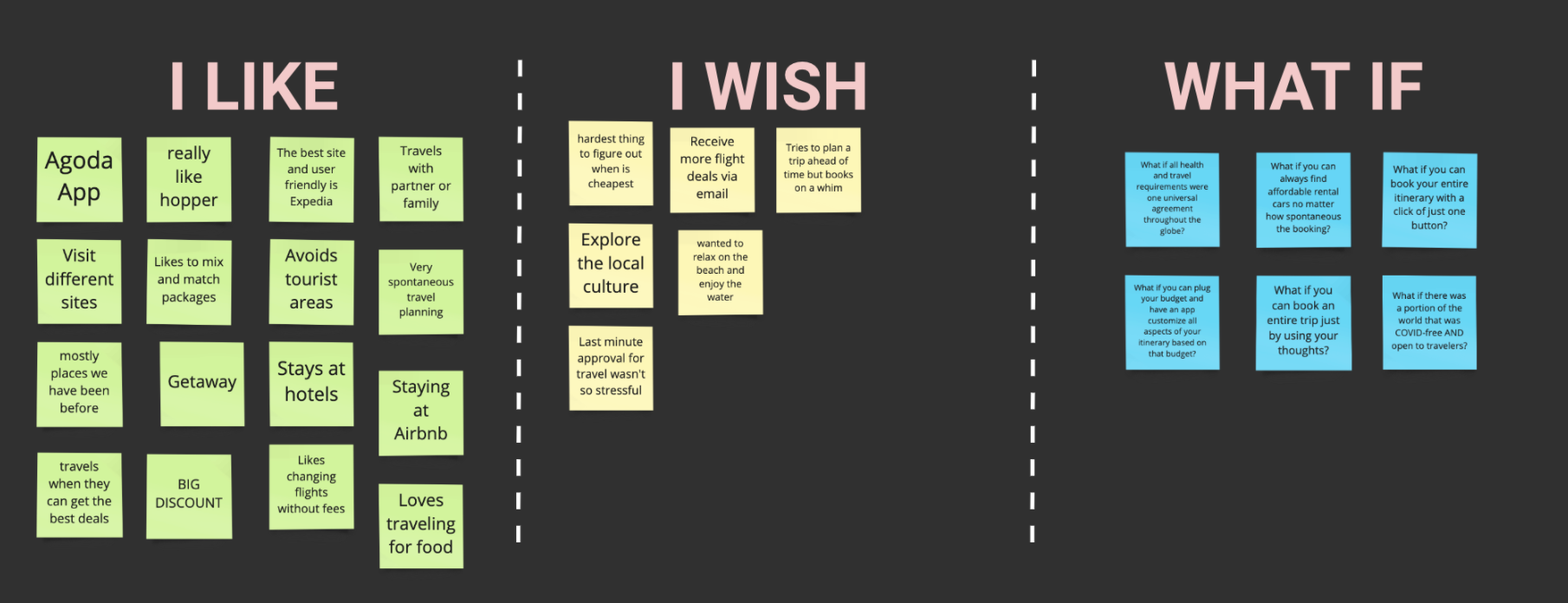
We began by interviewing 5 different people in order to discover user pain points of traveling post pandemic.
The data reflects a common theme: planning a trip takes a lot of time and research and is a frustrating process. In essence everyone wanted an easier way to organize their trip with safety, costs, time and location in mind.
EMPATHY MAP
We began by interviewing 5 different people in order to discover user pain points of traveling post pandemic.

DEFINITION & IDEATION
As we started to define our users and what their pain points and what they will gain when utilizing the Cinch app, we developed a User Persona to summarize our general users. The user persona of Lewis J helped us define a User Insight Statement and Problem Statement.
USER INSIGHT STATEMENT
Millennial travelers need to find affordable options when booking transportation, lodging and accommodations as well as all the safety and health requirements in one organized system and accessible platform.
Whether ensuring that they can stay within budget or to ensure they meet all the safety requirements at a new destination, travelers are spending a lot of time managing information between multiple platforms and websites.
This causes an overwhelming sense of anxiety and stress when travelers are booking and organizing a trip.

PROBLEM STATEMENT
We believe that providing real-time information in regards to booking flights, lodging, transportation, as well as all local health and safety requirements should be easily accessible in one platform for travelers that are on-the-go and have budget constraints. Travelers will be able to achieve a way to access current information related to their needs and will be accessible in an organized and seamless platform. How can we provide a platform for travelers that will display information that addresses their safety, budget, and other travel requirements in an organized fashion?
VALUE PROPOSITION
Cinch is your one-stop shop for booking hotels, accommodations, flights, and transportation based on your profile, interests, and budget needs while also offering current information on local safety and health requirements. Cinch aggregates real-time information across all websites and platforms allowing you to access valuable information all in one place.
FEATURE PRIORITIZATION
We wanted to see what factors were the most motivating to our users when they are planning their trips so we sythesized the data from our user interviews into a Feature Prioritization Matrix.
VALUE PROPOSITION MATRIX
We then synthesized this data in order to determine the complexity of solving user issues based on it's impact and how much of a priority it is to our users.


USER SCENARIO
Developing the user scenario allowed us to empathize with Lewis Jahar when he encounters a typical travel booking and how he will interract with our app and the rewards he experiences to complete booking his travel itinerary for an upcoming trip.
USER JOURNEY
We also wanted to convey what the user journey would be for Lewis Jahar to dive deeper into the pain points and what the users gain when interacting with the Cinch App.
STORYBOARD
The storyboard allowed us to illustrate the user scenario we created based on Lewis Jahar.

ITERATION & FEEDBACK
I was able to get valueable feedback from users in order to iterate the iOS Mockups.
“Good problem statement. Should consider being a UX writer. There’s a lot of information out there and it is time consuming to gather all information related to your travel itinerary.
Value Proposition allows to convey clear information about your product and what it really does.
All information is clear and concise. Addresses all the users' frustrations before and during the app*
-Sharon Navarro
COMPETITOR ANALYSIS
We conducted a Competitor Analysis by examining some of the leading competitors currently in the travel market in cluding TripIt, TravelPerk, Kayak and Expedia.
We wanted to ensure that we knew what the user experience is with each brand and how we can be inspired by the experience but also gain crucial insight on areas where there is need for improvement and growth for the user.
USERFLOW
We began by interviewing 5 different people in order to discover user pain points of traveling post pandemic.

LO-FI SKETCHES
I tested a low-fidelityiOS Mockup using this prototype using InVision


USABILITY TESTING PLAN
I was able to then start iterating with a mid-fidelity iOS Mockup which we would use for further usability testing.
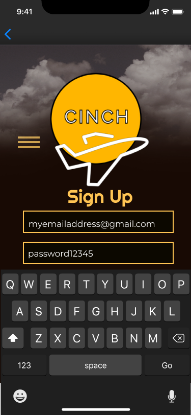
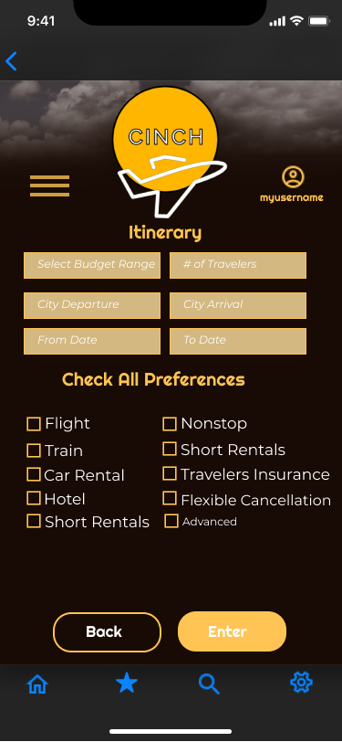
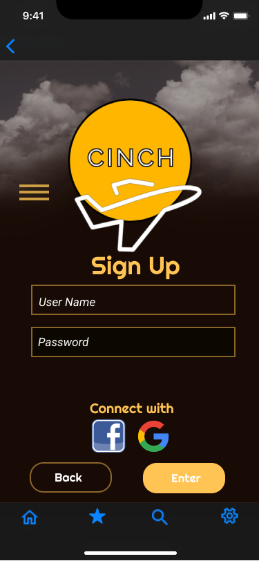
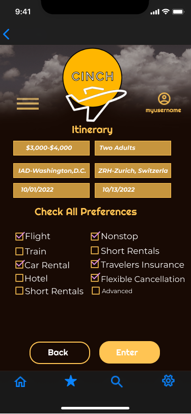
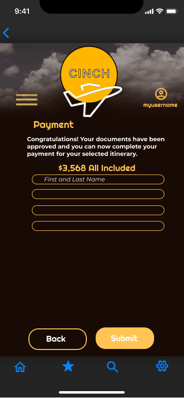
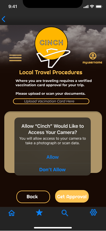
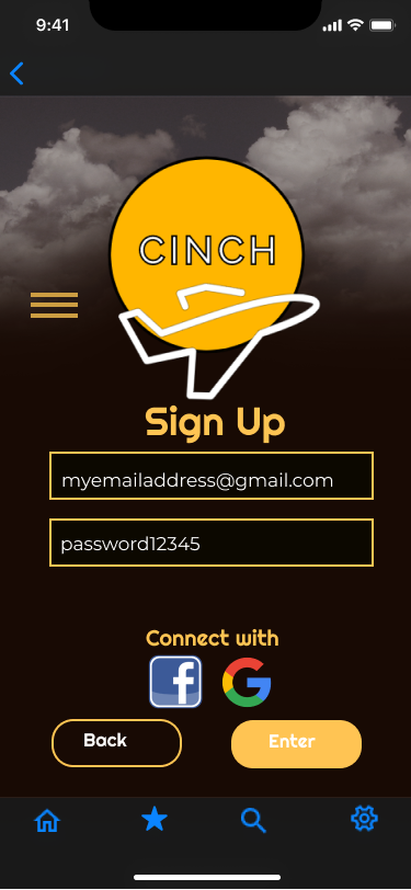
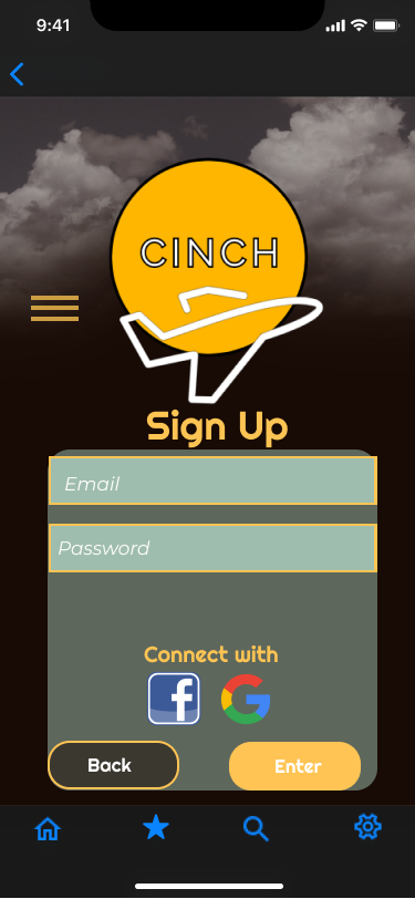
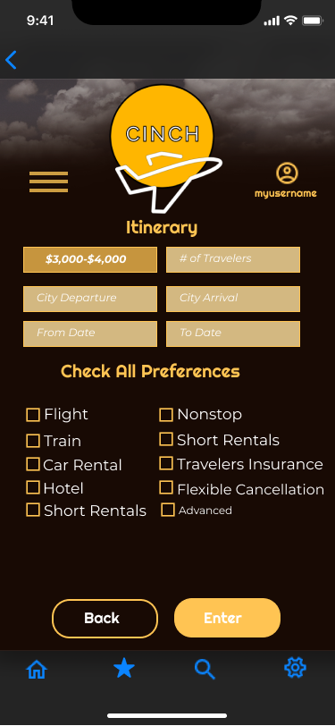
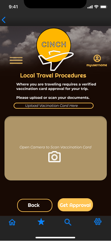
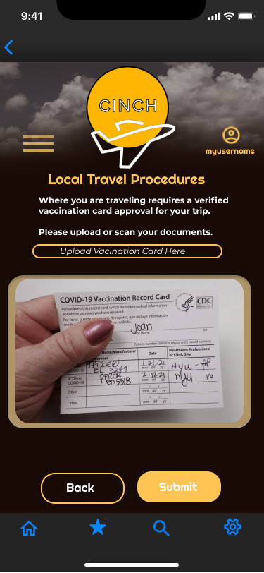
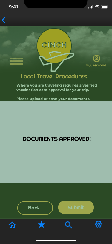
These iOS Mockups were created so that the User can sign up for an account, go through the itinerary process based on their travel preferences, and utilize the built-in camera feature to scan their travel documents using the app for instant approval based on the destination’s local government guidelines.
These mockups were utilized for iOS and can be viewed here.
USABILITY TESTING & ANALYSIS
I conducted a guerilla usability testing amongst a diverse pool of users ranging in gender and ages between 30-60 years of age to test my iOS prototype of Cinch App. Users were ask to complete three tasks: sign up, go through the itinerary process, and scanning travel documents to gain instant government approval of their status in order to book their trip and travel safely to their desired destination.
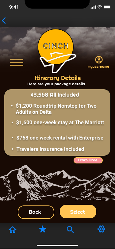
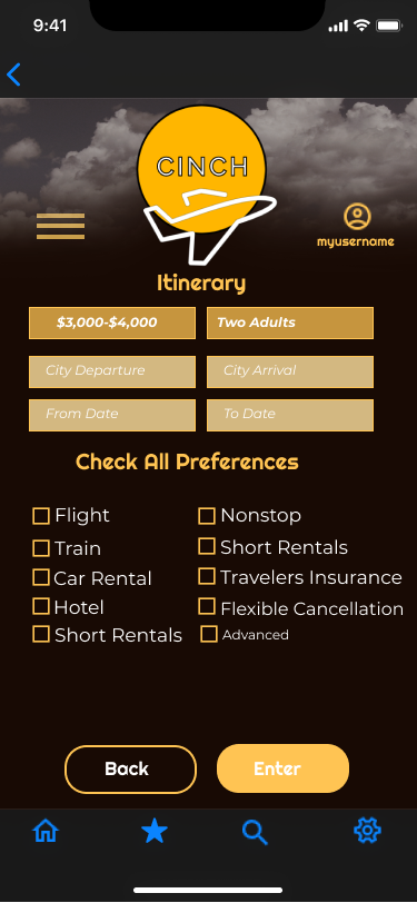
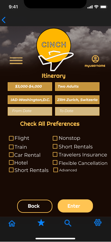
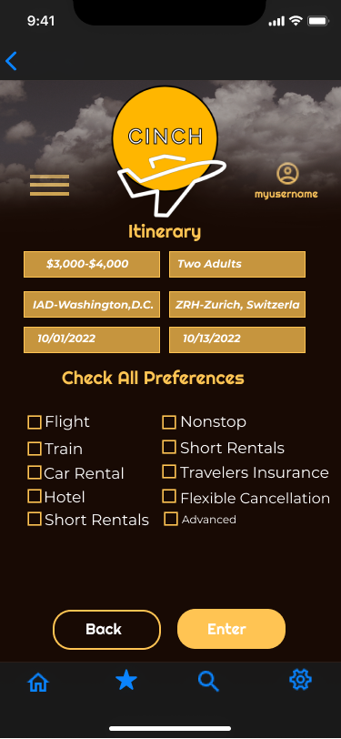
iOS MOCKUPS
iOS Mockups were created so that the User can sign up for an account, go through the itinerary process based on their travel preferences, and utilize the built-in camera feature to scan their travel documents using the app for instant approval based on the destination’s local government guidelines. These mockups were utilized for iOS and can be viewed here:


USABILITY TESTING PLAN
Creating a usability testing plan allowed us to prepare thoughtful questions to understand how the user experience can be improved as well as the strengths in using the current version of the Cinch App.
USABILITY TESTING & ANALYSIS
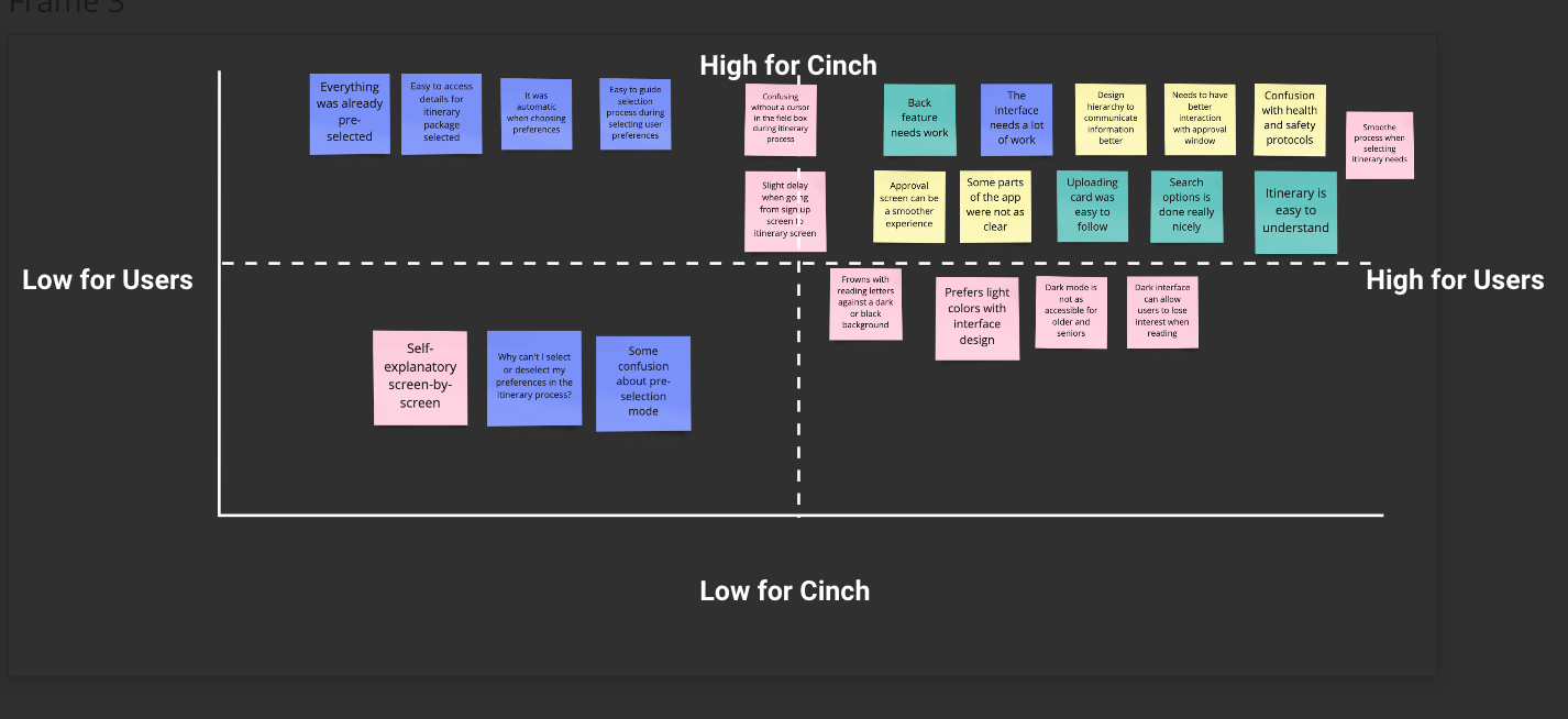
Based on the usability testing, I learned that there is a lot of work that can be done with the interface elements to better communicate the procedures especially within the itinerary screen. Improving some of the interface elements such as color contrasts between text and buttons for better visibility will create a more enjoyable user experience. Another feature to include within the interface during the itinerary screen is allowing users to have drop-down menus to select their preferences instead of having them pre-filled.
The first usability test was done prior to iterating on the scanning document process and it was improved greatly with their feedback. When testing the new iteration of the document scanning process, the users felt it was a more seamless experience to scan documents and get instant approval on our app. Users that want to go back a few screens had some issues using the “back” button and would need to be iterated in the next phase. There was some concerns on designing with dark mode and may face accessibility issues with older and senior users.

CONCLUSION
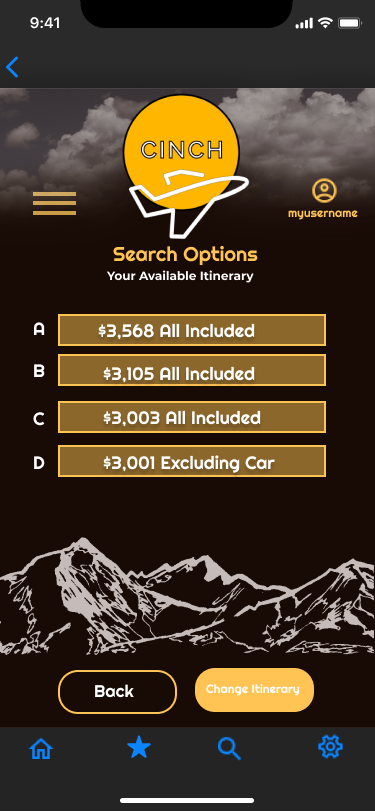
With the next phase of iteration I would improve the itinerary screen by focusing on improving interface design elements such as font color, button color contrast, and more drop-down features. The itinerary search details screen could also show more pertinent information to their packages to help the user understand how to compare between packages to arrive at a decision with more detailed information on each package. I would have an interactive screen where you can go between package options that highlight why that package was suggested (i.e. cheaper flights, five star hotel vs three star hotel, free hotel stay, etc).
I would also continue to add another task flow of being able to submit the documents after receiving instant approval status in order to pay for their package and complete booking their trip on the Cinch app.